B2C
Concept Project
Mobile App
Designing a system for a request no one should have to make in public
Designed a two-sided mobile app concept connecting blood donors and patients, focused on privacy, consent, and urgency.
Defined product concept, features, and direction; created a design system, and enhanced the design process through AI-assisted prototyping, enabling faster exploration and validation of design decisions with a small user group.
Result: 90% task completion for creating blood request campaigns; users reported the app as intuitive and easy to use.
Role
Product Designer
timeline
2 months (+ UI iteration in 2025)
scope
Mobile app • Two-sided platform
note
Self-initiated project. No client, no launch.

Context
In Mexico, only 5% of blood donations are altruistic. When patients need blood, families rely on social media, posting publicly and hoping someone responds. The process is uncertain, public and exhausting.
Existing platforms focused on listing donors or hosting campaigns, but none addressed the friction on both sides: patients who needed a safe, private way to ask, and donors who wanted to help but needed control over when and how they committed.
Patients struggle with the exposure of asking for blood donations.
KEY DECISION
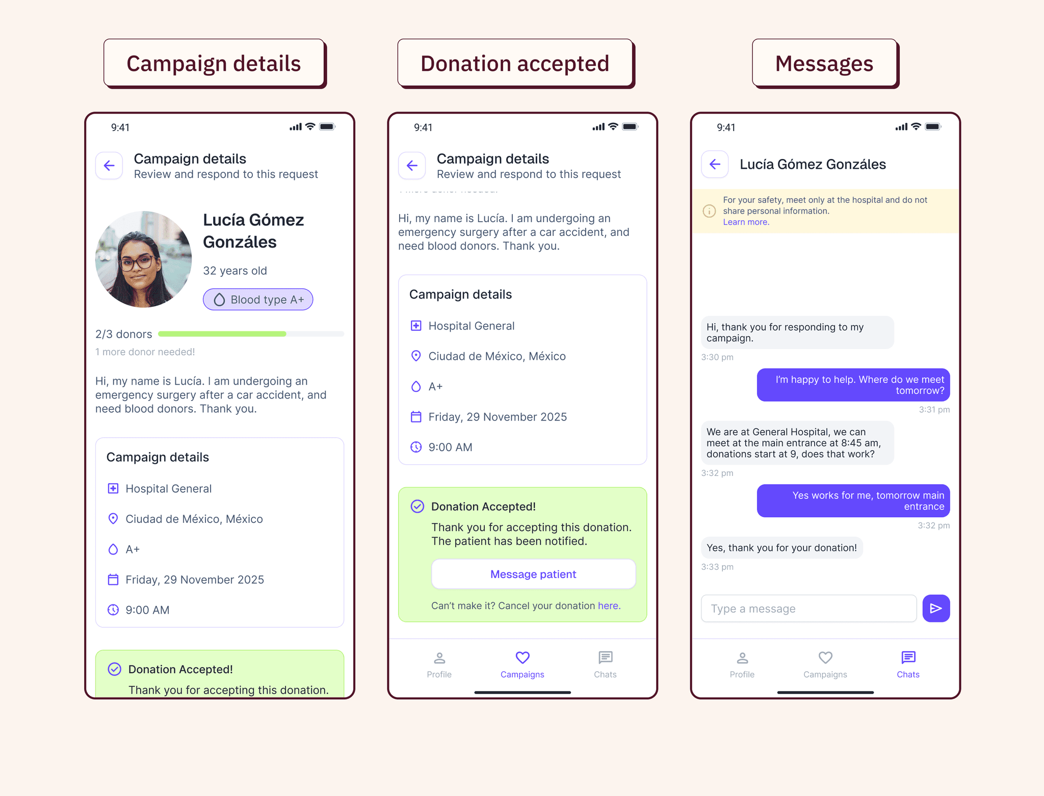
System overview
Instead of a directory, Blood+ works as a two-sided system.
Patients create blood donation campaigns, and the system connects them with compatible donors, who can choose to respond privately.

Connecting 2 sides for a common goal
Design decisions
Key features
Tradeoffs
Protecting donor privacy meant limiting patient control
Initially, I explored letting patients message donors directly. But that introduced pressure and undermined the privacy the app was designed to protect.
Giving control to donors creates friction for patients
Shifting control to donors protects them, but it can slow responses and frustrate patients, especially with a small donor base. Without enough active donors, the system breaks. It pushed me to think of mechanisms that make donating easy, recognizable, and worth repeating.
Donor retention
One of the main challenges the app faces is donor sign up and retention.
I explored different ideas to create an engaging emotional experience that brings donors back:

The outcome
Validated the core system through usability testing.
I tested the concept with four users who had either donated blood or helped find donors before.
The core model held up. Users on both sides understood the system without guidance, donors understood they controlled availability before being matched, and patients could request help without posting publicly. The two-sided structure made sense intuitively.
Where it broke down was navigation, not the concept. Discoverability issues pointed me to specific fixes before moving to hi-fi.
Donors
Choose when and how to help without pressure, keeping every donation fully altruistic.
If i launched this
How do you get donors to sign up and actually stay active?
The retention mechanisms I explored are only useful if there's a donor base to begin with. I'd want to know if they're enough or if the real challenge lives somewhere else entirely.
What happens if no donor accepts in the first round?
I explored the happy paths thoroughly, but the not-so-happy ones, especially for a patient waiting on blood need just as much attention.
Is automatic matching helpful to create trust and make donating easier?
Once the app is in use, patterns might emerge. Workarounds, behaviors, ways patients and donors find each other that I didn't design for. Those could point to a better solution than the one I built.
I'd like to follow closely how many donations actually happen, how both sides feel using it, and whether the system holds when donor availability is low.